28 December, 2015. End-of-year chaos … Here is my still missing self-evaluation accompanying Assignment 5, following p. 7 of the study guide for the last time in this course:
1. Demonstration of technical and visual skills
My choice of subject and methods for the last assignment was not made only out of interest in the medium, but I also had in mind a way of hopefully demonstrating increasing skills in the following areas:
layout
perspective
lighting
use of colour
drawing the human figure
creating a mix of harmony and tension in one work of art
2. Quality of outcome
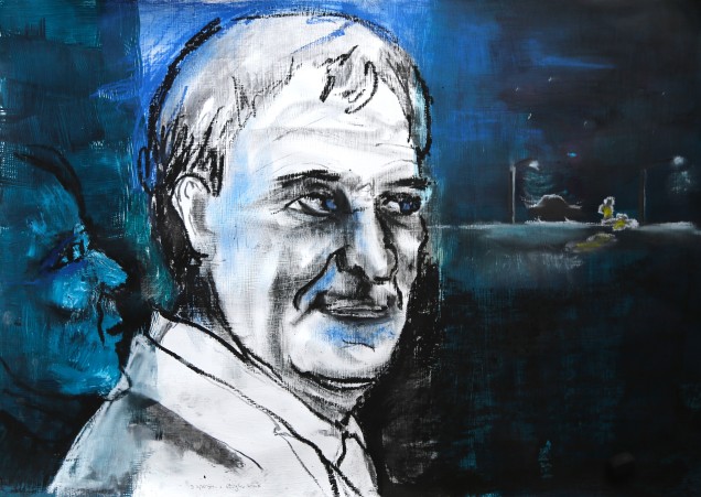
I think that all of these were relatively successful, although I am aware that the portrait, by being created from memory and adjusted by lighting experiments with a life model, may not be totally life-like. Still I think that I managed to capture in a believable way several changes in facial expression related to the narrative. A point I think I was not successful in transporting was the original idea that the portrayed person is the hit and run driver. Looking at the finished animation, however, this aspect may not be so relevant, since the person – whether driver or not – refused to help by turning a blind eye on the accident.
The animation itself is subjected to the physical limitations created by voltage fluctuations and camera shutter operation, but I think that the extensive editing of the individual photos reduced the associated interfering effects, so that the remaining flicker and wobble are in harmony with the story told.
3. Demonstration of creativity
I believe that I demonstrated a relative large degree of independent creativity by developing the idea of an animated portrait without borrowing from other artists while still incorporating technical aspects from animations studied in preparing the work. While the materials used (acrylics, pastel and charcoal mixed media) would not be innovative I have never seen anywhere the idea of, rather than animating the whole area, restricting an animation to a narrow horizontal strip (like a strip of film) of the prepared background. That way a portrait drawing remains what it is, while still communicating with the rest of the picture.
4. Context reflection
Since the subject of facial expressions reflecting personality changes after a dramatic experience requires understanding the underlying processes in order to transport them in a believable way, I spent a large amount of time researching facial expression by taking own photos, referring to scientific studies analysing facial expression and taking the information gained to produce serial sketches emphasizing the changes associated with the emotions of self-centred arrogance, fear, indifference and cruelty. In the process of doing so I learned to identify the zones of a face requiring adaptation to produce the desired effect.
26 December, 2015. We spent a beautiful, quiet Christmas, but today I have been given a day off to finish Assignment 5. Most of the work I did during the days before the Christmas holidays and as with my first animation the major part of the time I needed to edit the photos. I had thought at first that all my changes, including a tripod, an incredibly bright 500 W halogen floodlight, working with all the blinds closed in my workshop and taking two photos at a time would help to decrease the flicker in the photo series. But no, it was as bad as in the first animation. So I had another look on the web for stop motion forums and what did I find there? The main culprit are mains voltage fluctuations, which are next to unavoidable. Also, something I had not been aware of at all, was the physical impact on the camera and the tripod by the shutter opening and closing, so a wobbly image can only be avoided by taping the camera down (!) on a very stable, heavy surface. Well, never mind. I had a few very intense days editing photos with some success and composing the animation, which also gave me the wonderful opportunity to think about rhythm in an animation and while I can already see the places for further improvement I am happy with the result. Also, and no matter what the outcome of the official assessment, first of all it is a message of hope dedicated to my little son and so tying the ends of the thread running through this blog.
My tutor advised me to upload the film to vimeo. I marked it private, since it might not be suitable for younger children to watch. The link is https://vimeo.com/150048400 and the password Hit_and_Run. Since this is a first version likely to require some more editing after tutor feedback, the size of the film is small. If required, I will replace it by a larger size format for formal assessment.
Which makes me realise that all that remains for this course is my artist’s statement and the actual preparation for formal assessment. There is still a lot of work to do, especially regarding reworking a few of the earlier pieces, but I think I am making good progress and I am looking forward to revisiting the different stages of the course.
All websites mentioned in this post were accessed on 19 December 2015. All images shown are in the public domain.
19 December, 2015. Oh no, I misinterpreted the instructions regarding the timing of the final video tutorial as having to choose a date BEFORE completing my work, but in retrospect it was great to have a work-in-progress feedback talk. I received several great suggestions connecting to the overall idea behind my project – which my tutor could see much more clearly than I did at the moment of the video talk! For me the project started out as an attempt to show the changes to a personality if a golden standard of human coexistence, in this context the obligation to help in a moment of great peril, is not observed out of pure self-interest. My tutor pointed out to me the connection to philosopher Arthur Schopenhauer (1788-1860). The moment I write this I can feel how a whole world of philosophical concepts opens up, wanting to be explored. The idea makes my head swim and I need to take care to stay focused on my project when doing the underlying research here.
Schopenhauer in 1815, second of the critical five years of the initial composition of Die Welt als Wille und Vorstellung, oil paintig by Ludwig Sigismund Ruhl
Looking up the Wikipedia information on Schopenhauer: In his famous 1819 work “Die Welt als Wille und Vorstellung” he describes the characterization of the phenomenal world, and consequently of all human action, as the product of a blind, insatiable, and malignant metaphysical will. “Phenomenal” in this context is used to convey the idea that the impression gained of the world surrounding us is structured by the human mind. As a biologist I agree with this view (not something I would readily do with a number of Schopenhauer’s ideas) and I think that on a very basic level of the concept nothing explains this more clearly than the visible world: An idealised totally black object appears black to us, because its surface absorbs all wavelengths in the spectrum visible to the human eye, so no visual information about it arrives in our brain. Therefore we have no means whatsoever to verify the object’s true colour, because all we are and perceive is absolutely and unalterably limited by the rules of physics governing our bodies. In the context of my project the perception by the portrayed person of the situation presented to him is likewise analysed and filtered by his brain in a multi-level process, which results in a representation in his mind modified by experiences gained throughout life and which may not truly reflect all aspects of the real event. Importantly, the appearance of this internal cosmos is subjected to the same limiting rules which govern the perception of the outside world. Which I think is the meaning of “blind” in the above description and which ties in well with the word “malignant” transporting the idea that the pain caused by this controlling instance can only be overcome by asceticism in order to experience the immersion with the world surrounding us. This is, I fear, a lifelong, often futile struggle and as pointed out by Schopenhauer, with luck we may discover art, in particular music, as a means of “becoming one with perception”. The person in my project, however, is far from wanting to blend in with his surroundings, on the contrary: by consciously choosing not to allow an analysis of the meaning of the perceived situation (child left lying on the ground, perhaps to die), he wills a distortion of the situation in order to fit in with his self-image. The price he pays is high, since in a mentally healthy human being the innate and learned, deep-rooted ethic conventions and beliefs continue to work in an internal struggle underneath the immaculate surface until they begin to show.
My tutor emphasized the importance of reflecting about the impression of this internal struggle gained by the viewer. He had the wonderful idea of making the animation a loop in order to emphasize this struggle with reference to Dante’s Inferno, see e.g. https://en.wikipedia.org/wiki/Inferno_%28Dante%29. A representation of the Ninth Circle as seen by the famous series of engravings by Gustave Doré:
Dante speaks to the traitors in the ice, Canto 32 (Divine Comedy by Dante Alighieri, illustrations by Gustave Doré, Wikimedia Commons)
For the purpose of my project the ninth of the circles described is reserved for the traitors, who are punished by being encased in ice depending on the severity of the sin committed. It would be interesting to include a reference to ice in my portrait, but in that way the multiple layers of messages may become too difficult to read. The planned hardening of the face as an outward sign of developing a “heart of ice” may already suggest a connection. I also thought that every iteration of the occurrence would be likely to cause another slight change on the person’s face, but for the purpose of this project I should stay with the initial change and explain the idea of an extension in the artist’s statement accompanying the project.
Since a lot of the changes will affect and be communicated via the person’s eyes anyway, my tutor also suggested to have a look at the work by Steve McQueen, both his film “Twelve Years a Slave” (see trailer on https://www.youtube.com/watch?v=vUQNjfhlREk) and his earlier work winning him the 1999 Turner Prize. Unfortunately I am not much of a cinema-goer because of severe time constraints and it took me a few minutes to realize which Steve McQueen I was supposed to look for (see https://en.wikipedia.org/wiki/Steve_McQueen_%28director%29 and http://www.imdb.com/name/nm2588606/bio?ref_=nm_ov_bio_sm). For the reason of there being two of the same name it proved quite difficult to produce a consistent search on his artwork, because the other Steve McQueen kept interfering to a very annoying degree. I did not during this search succeed in finding the connection, in both McQueen’s films and other works of art, to my own working with transporting messages via the eyes. I noticed, however, that McQueen uses both his own body (as in http://steverodneymcqueen.tumblr.com/) or for example, in his function as official Iraq artist, the photographed portraits of Iraq war soldiers in a very dense way, portraits on stamps but multiplied (see e.g. http://www.zimbio.com/pictures/h64OV0ssZ59/Steve+McQueen+Opens+Latest+Exhibition+Iraq/Toc9l1oUaxI/Walter+Douglas). After a while of searching the net I began to see that the connection is probably made in an inversed way. McQueen often assumes quite unusual positions to make his short film, allowing the viewer to witness everyday situations from a different viewpoint and add to the experience we all have of these situations (see e.g. the clips taken at the Schaulager Basel in 2013, http://steverodneymcqueen.tumblr.com/ or Drumroll 1998 on https://www.youtube.com/watch?v=9oGO2mawifA, which was one of the foundations for McQueen being awarded the Turner Prize in 1999). I still cannot see a direct connection of these experiences to my own project, but I will keep them – and others I will hopefully come across doing more research – in mind to allow them to intrude while making the animation.
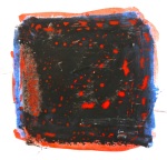
09 December, 2105. We are waiting again. Several weeks ago the hospital should have at least acknowledged the receipt of our expert’s report. Nothing. Why? No idea, it is beyond my understanding of a fair world. And as always in a situation like that I notice that my mind is not set 100% on the OCA task I had planned for today. I prepared a sheet of paper with two layers of dispersion paint, then half of it with an additional layer of white acrylic. These not completely dry I covered part of each side with night blue ink. On this background drew using charcoal, various pastels, oil pastel, an eraser and a nailbrush in order to discover a coat that would allow the charcoal elements of the animation to be erased without leaving too much of an interfering trace.
I tried to experiment with my layout, having decided that a landscape format would be ideal: There would be more space for the accident to happen in the background, while the potrait in the foreground would feel as if part of the ourdoor scene while still only being a portrait. When starting out on this test I had not had in mind to put in a portrait at all, so I would like to ignore the way it looks plus the colours chosen :o). It helped me, however, to familiarize with the available space and the relative position of the elements required for the animation in relation to the portrait.
From a little test of spreading acrylic white on the wet ink with some paper tissue resulted a demon’s head to the left of the doctor, whispering into his ear. I quite like this detail, but it will not be part of the animation as there should not be too many things happening at the same time.
07 December, 2015. A few days ago I experimented with the brilliant white, smooth paper I am planning to use as my support for the animation to test a few mixes of materials:
1: Ink, charoal and white pastel
2: watercolour, charcoal and eraser
3: Oil pastel and pastel
4: Charcoal, white pastel and eraser
5: oil pastel, nail brush and white pastel
6: Oil pastel and watercolour
7: Watercolour, pastel and oil pastel
8: Watercolour, oil pastel, pastel and eraser
9: Oil pastel, watercolour and marker
10: Oil pastel, watercolour, marker and nailbrush
Doing this I noticed some effects, which I will keep im mind for my next experiments regarding the initial portrait:
Preparing the already smooth paper with an ink background makes alterations to a top layer of charcoal or pastel crayons very easy. Even the darker areas of charcoal could be erased without trace, if needed (example 1)
Preparing two layers of oil pastel on top of each other can be scratched with a nailbrush to produce some fascinating effects. Also, and important for my experiment: using a finger the top layer of oil pastel can be spread again to form a closed layer (example 5)
Drawing with oil pastels on a not quite dry underground of watercolour lifts the surface of the paper, producing interesting structures
All websites mentioned in this post were accessed between 2 and 5 December 2015.
02 December, 2015. I just realised that I will have to portray someone dependent on his professional power and social status to nurture his self-confidence. He knows that the incident with the car has immense destructive quality in that respect and therefore has to be kept secret. Being a doctor means to betray both the ethos as a human being and as a professional to keep up the now false image. Both are rightly condemned by society, therefore the fear of being found out. The portrait needs to convey these conflicting interests in the matter of an instant, i.e. between realising the accident has happened and the decision to drive on without helping. Therefore, a charcoal portrait may not be sufficient to qualify as transporter of status. Since I experimented with acrylic mixed media earlier this year, I might refer to the experience gained making the drawing of the skeleton of a radiolarian skeleton. The acrylic background should however not take up the whole of the paper or cardboard, so that the charcoal accident can happen, dissolve and creep up the acrylic face. I need to take care that the colours depicting facial features to be changed provide a smooth surface. Once I have completed the preliminary experiments I will decide on the best way to deal with this subject.
05 December, 2015. The first step in the process, however, is some research into works of art transporting the emotions of fear and cruelty as well as portraits allowing direct contact with the viewer. Instantly I found a connected series of portraits by Theodora Sutton (http://cargocollective.com/theodorasutton/rotoscope-animation-1). While the style and colour change slightly with each portrait and the viewpoint rotates around her face, the person never takes her eyes off the viewer apart from a short moment when she is depicted with her eyes closed. As mentioned in my Assignment 4 reflections, my tutor also pointed me to the work of Dryden Goodwin, who attempts to capture the intensity of his encounters in his portrait drawings (Jack Southern in interview with Deryden Goodwin in the book Drawing Projects). A video interview on http://www.drydengoodwin.com/videolinks.htm emphasizes again his intention not to merely catch a physical likeness, but to weave into the drawing “something that cannot be seen”, a quality, which is, I think, communicated by intuition only and which acts to make an important difference between a portrait and a portrait that moves one to tears (as e.g. in Käthe Kollwitz). Connecting smoothly with my own intentions is Goodwin’s 2010 project “Linear”. Jubilee line staff was portrayed (with line drawings) and the process of drawing with the members of staff talking in the background about their work experiences filmed. Viewing the two media side by side allows not only the process of drawing to become tangible within the finished piece. The stories told are very likely to have influenced Goodwin’s drawing. My own approach does nothing else apart from the important fact that the story told is in part fictional and the reaction of the portrayed person imaginary. In that way my project is only partly documentary and more heavily influenced by my own a priori interpretation of what is going to be.
Since the main emotion to be transported in my portrait is fear, I also had a look at a number of artists working in that field. Philip Hicks’ fearful portrait “Victims I” (http://www.tate.org.uk/art/artworks/hicks-victims-i-p01417) is brilliant and a wonderful source to study the facial features associated with that particular emotion, but I do not understand why he would have wanted to surround it with symbols, taking away some of its intensity. Marlene Dumas’ haunting 2004 portrait “Lucy” (http://www.tate.org.uk/art/artworks/dumas-lucy-t12313) on the other hand does, of course, not capture an emotion on the face of the girl, but its all-too-easy-to-interpret posture evokes the same feeling, instantly, in the viewer. This made me realise that in my project the accident, leaving a dying child behind, may greatly increase the emotional load of the whole drawing – and importantly not with contradictory but the same types of emotion. I was also glad to find John Keane’s “Fear” series, which won the 2015 Aesthetica Art Prize (http://www.yorkstmarys.org.uk/news-media/latest-news/winners-announced-for-the-aesthetica-art-prize-awards-2015/). It shows oil paintings made on the basis of Moscow trial mug shots and instantly connects with my research and drawings of George Stinney. The paintings work not only through a believable depiction of an emotion, but of course by their sheer size and, importantly, through a very cleverly used communication of light and dark with the actual faces. The most haunting of these were, in my opinion http://www.flowersgallery.com/works/view/13631-fear-no-191037 and http://www.flowersgallery.com/works/view/14672-fear-no-48818665, both of which appear to effuse cruelty and trigger a feeling of fear in the viewer. I will keep this technique in mind when planning the layout of my own drawing.
Thinking about my own project things suddenly become more complex, because the accident raises fear, for different reasons, both in the viewer and the doctor, but when the experience acts to change the doctor’s face to radiate cruelty, looking at the face should increase the feeling of fear in the viewer.
Given that I succeed in depicting the emotions correctly. Which means that the next step in the process will be to take out my sketchbook and investigate the facial features characteristic of fear and cruelty.