Part 5: Personal project – reflection on video tutorial

All websites mentioned in this post were accessed on 19 December 2015. All images shown are in the public domain.

19 December, 2015. Oh no, I misinterpreted the instructions regarding the timing of the final video tutorial as having to choose a date BEFORE completing my work, but in retrospect it was great to have a work-in-progress feedback talk. I received several great suggestions connecting to the overall idea behind my project – which my tutor could see much more clearly than I did at the moment of the video talk! For me the project started out as an attempt to show the changes to a personality if a golden standard of human coexistence, in this context the obligation to help in a moment of great peril, is not observed out of pure self-interest. My tutor pointed out to me the connection to philosopher Arthur Schopenhauer (1788-1860). The moment I write this I can feel how a whole world of philosophical concepts opens up, wanting to be explored. The idea makes my head swim and I need to take care to stay focused on my project when doing the underlying research here.

Arthur_Schopenhauer_Portrait_by_Ludwig_Sigismund_Ruhl_1815
Schopenhauer in 1815, second of the critical five years of the initial composition of Die Welt als Wille und Vorstellung, oil paintig by Ludwig Sigismund Ruhl

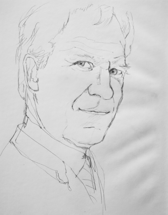
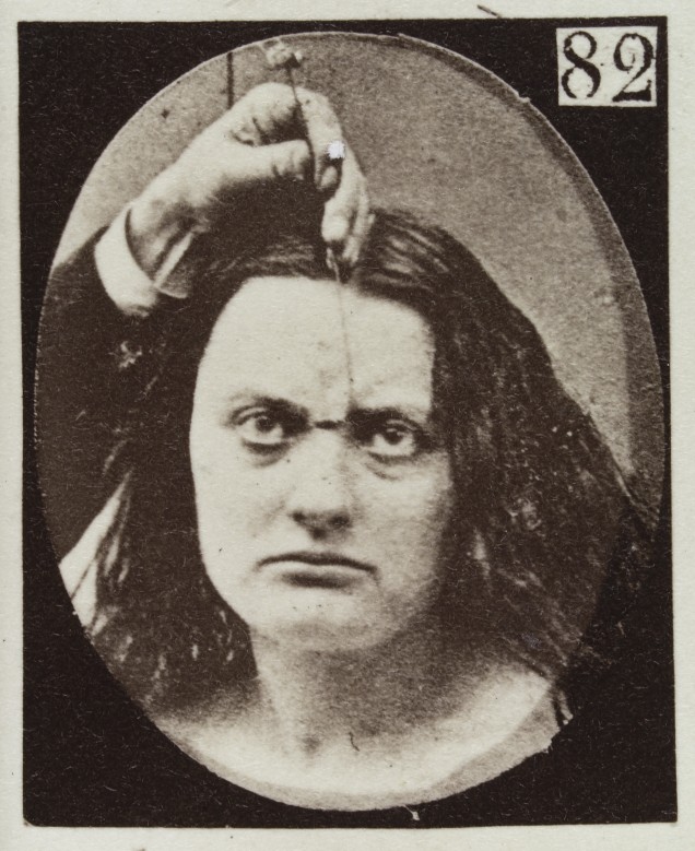
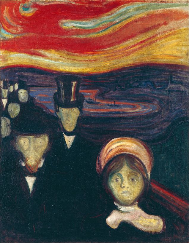
Looking up the Wikipedia information on Schopenhauer: In his famous 1819 work “Die Welt als Wille und Vorstellung” he describes the characterization of the phenomenal world, and consequently of all human action, as the product of a blind, insatiable, and malignant metaphysical will. “Phenomenal” in this context is used to convey the idea that the impression gained of the world surrounding us is structured by the human mind. As a biologist I agree with this view (not something I would readily do with a number of Schopenhauer’s ideas)  and I think that on a very basic level of the concept nothing explains this more clearly than the visible world: An idealised totally black object appears black to us, because its surface absorbs all wavelengths in the spectrum visible to the human eye, so no visual information about it arrives in our brain. Therefore we have no means whatsoever to verify the object’s true colour, because all we are and perceive is absolutely and unalterably limited by the rules of physics governing our bodies. In the context of my project the perception by the portrayed person of the situation presented to him is likewise analysed and filtered by his brain in a multi-level process, which results in a representation in his mind modified by experiences gained throughout life and which may not truly reflect all aspects of the real event. Importantly, the appearance of this internal cosmos is subjected to the same limiting rules which govern the perception of the outside world. Which I think is the meaning of “blind” in the above description and which ties in well with the word “malignant” transporting the idea that the pain caused by this controlling instance can only be overcome by asceticism in order to experience the immersion with the world surrounding us. This is, I fear, a lifelong, often futile struggle and as pointed out by Schopenhauer, with luck we may discover art, in particular music, as a means of “becoming one with perception”. The person in my project, however, is far from wanting to blend in with his surroundings, on the contrary: by consciously choosing not to allow an analysis of the meaning of the perceived situation (child left lying on the ground, perhaps to die), he wills a distortion of the situation in order to fit in with his self-image. The price he pays is high, since in a mentally healthy human being the innate and learned, deep-rooted ethic conventions and beliefs continue to work in an internal struggle underneath the immaculate surface until they begin to show.
My tutor emphasized the importance of reflecting about the impression of this internal struggle gained by the viewer. He had the wonderful idea of making the animation a loop in order to emphasize this struggle with reference to Dante’s Inferno, see e.g. https://en.wikipedia.org/wiki/Inferno_%28Dante%29. A representation of the Ninth Circle as seen by the famous series of engravings by Gustave Doré:

Gustave_Dore_Inferno32
Dante speaks to the traitors in the ice, Canto 32 (Divine Comedy by Dante Alighieri, illustrations by Gustave Doré, Wikimedia Commons)

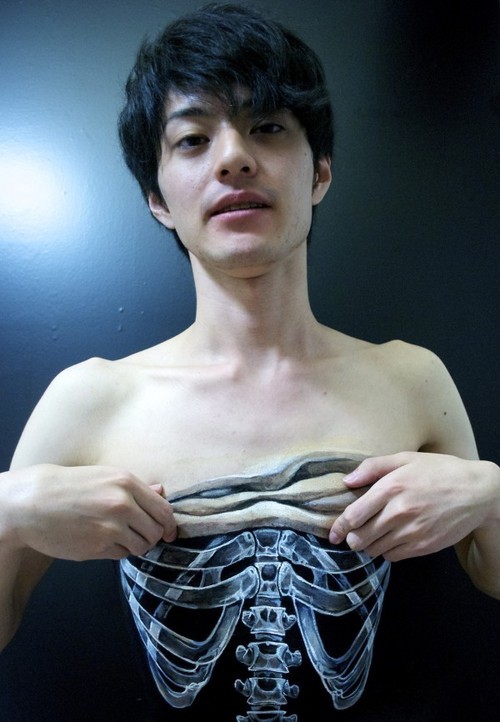
For the purpose of my project the ninth of the circles described is reserved for the traitors, who are punished by being encased in ice depending on the severity of the sin committed. It would be interesting to include a reference to ice in my portrait, but in that way the multiple layers of messages may become too difficult to read. The planned hardening of the face as an outward sign of developing a “heart of ice” may already suggest a connection. I also thought that every iteration of the occurrence would be likely to cause another slight change on the person’s face, but for the purpose of this project I should stay with the initial change and explain the idea of an extension in the artist’s statement accompanying the project.
Since a lot of the changes will affect and be communicated via the person’s eyes anyway, my tutor also suggested to have a look at the work by Steve McQueen, both his film “Twelve Years a Slave” (see trailer on https://www.youtube.com/watch?v=vUQNjfhlREk) and his earlier work winning him the 1999 Turner Prize. Unfortunately I am not much of a cinema-goer because of severe time constraints and it took me a few minutes to realize which Steve McQueen I was supposed to look for (see https://en.wikipedia.org/wiki/Steve_McQueen_%28director%29 and http://www.imdb.com/name/nm2588606/bio?ref_=nm_ov_bio_sm). For the reason of there being two of the same name it proved quite difficult to produce a consistent search on his artwork, because the other Steve McQueen kept interfering to a very annoying degree. I did not during this search succeed in finding the connection, in both McQueen’s films and other works of art, to my own working with transporting messages via the eyes. I noticed, however, that McQueen uses both his own body (as in http://steverodneymcqueen.tumblr.com/) or for example, in his function as official Iraq artist, the photographed portraits of Iraq war soldiers in a very dense way, portraits on stamps but multiplied (see e.g. http://www.zimbio.com/pictures/h64OV0ssZ59/Steve+McQueen+Opens+Latest+Exhibition+Iraq/Toc9l1oUaxI/Walter+Douglas). After a while of searching the net I began to see that the connection is probably made in an inversed way. McQueen often assumes quite unusual positions to make his short film, allowing the viewer to witness everyday situations from a different viewpoint and add to the experience we all have of these situations (see e.g. the clips taken at the Schaulager Basel in 2013, http://steverodneymcqueen.tumblr.com/ or Drumroll 1998 on https://www.youtube.com/watch?v=9oGO2mawifA, which was one of the foundations for McQueen being awarded the Turner Prize in 1999). I still cannot see a direct connection of these experiences to my own project, but I will keep them – and others I will hopefully come across doing more research – in mind to allow them to intrude while making the animation.


Part 5: Personal project – sketching social status, fear and cruelty

All websites mentioned in this post were accessed on 6 December 2015, all images shown are in the public domain.

06 December, 2015. Social intelligence is required to allow successful interaction within society. Successful in the context of my project is the ability to hide from others a fact which, once publicly known, would reduce the individual’s fitness, e.g. my doctor, when found out, would without doubt lose his prestigious job and associated social amenities. From his point of view a behaviour envolving the masking of a true emotion is socially intelligent and thus to be enforced. In Schmidt, K. L. and Cohn, F. (2001) (http://www.ncbi.nlm.nih.gov/pmc/articles/PMC2238342/) the social aspect in the evolution of facial expression is discussed.

In order to continue getting acquainted with the expression of fear through firsthand impression I thought that I might study the Austrian Krampus runs, taking place at the beginning of December in each and every village. I took several photos in our own village, but I noticed that the commercialisation of the tradition and a very justifiable ban of hitting people with birch twigs has turned the whole thing into a fun event. No frightened people here, just some girls feeling a bit uneasy, and a scared cat.

Cat_frightened

Then I had a look at other photos we took over the years. No frightened people either, which is a good thing in one way, but not helpful in another. Here is our younger son with something like worry on his face, but this is certainly not strong enough:

The closest I could get to a fearful face comes here, from a funfair ride (the face was taken from a much larger photo, sorry about the quality):

Frightened_1

Since while there are no good actors in my family, my searches on the internet also convinced me that the people posing with fearful faces are no good actors either and press photos showing what I have in mind are exceedingly rare, I based my initial sketches on fear and cruelty on the images and works of art I have collected so far.

First I made a pencil sketch mini series. The first sketch is about status. Before starting it I had a look at paintings depicting royalty and found that a certain pose always correlated with an impression of power: The body is slightly turned to one side, but the stern eyes, looking down on the viewer from an otherwise indifferent face leave no doubt about who is in charge. An example is Hans Holbein’s portrait of King Henry VIII:

1024px-Hans_Holbein,_the_Younger,_Around_1497-1543_-_Portrait_of_Henry_VIII_of_England_-_Google_Art_Project

Hans Holbein the Younger, around 1497-1543
Portrait of Henry VIII of England, Wikimedia Commons

Here comes my sketch – apologies again for the problems with the paper in my sketchbook. I love the paper but not the wavy righthand side.

Status_pencil_sketch_06122015

This sketch I gradually changed to first show a slight worry, then a glimpse of fear, just enough to reveal the true emotion.

The  changes to the sketch were:

  • lifting the upper eyelids, thereby exposing the upper white
  • making the lower eyelids tense
  • lifting and drawing together the eyebrows
  • emphasizing the vertical folds between the eyebrows and the central horizontal folds on the forehead
  • slightly opening the mouth to expose the teeth
  • making the lips tense
  • reducing the tension around the corners of the mouth

I am not unhappy with the result. As before with my experiment involving Albert Einstein and Alzheimer’s disease I noticed that the changes in facial expression need to be slight only and always involve a characteristic set of alterations.

Cruelty next. Cruelty is no fleeting emotion, it is a deep-rooted character trait, which with time seeps to the surface to show permanently. I believe that, in contrast to fear, it is impossible to hide cruelty behind a sweet face. Looking at my character above I notice that a certain amount of cruelty is already present, so I will need to identify the typical characteristics and reinforce them: It appears that an outward impression of cruelty, described as “indifference to suffering and even pleasure in inflicting it” on Wikipedia (https://en.wikipedia.org/wiki/Cruelty) often comes with a totally indifferent or marginally amused face (dictators!), while sometimes the lower white of the eyes is visible, as in:

L0040123 Experiments in physiology. Facial expressions; Cruelty
L0040123 Experiments in physiology. Facial expressions; Cruelty Credit: Wellcome Library, London. Public domain

07 December, 2015. Here is the last change to my pencil sketch. I believe that it contains a mix of cruelty and disdain and this is, coming to think of it, just what is required.

Cruelty_07122015

What I did was the following:

  • lift the eyebrows
  • emphasize some horizontal folds on the forehead
  • slightly close the upper eyelids
  • reduce the tension on the lower eyelids
  • make sure some white appears below the pupils
  • ever so slightly open the mouth
  • suggest a slight curling of the corners of the mouth

In order to increase cruelty I might close the upper eyelids further until they appear to cover part of the pupil, but for my project this slight change is just what I need. A greater change would not go together with maintaining his position as a doctor.

To be honest it was this part of my preparations I had dreaded before its start, because I did not know whether I would be able to produce the desired effects, but all seems well. The next step will be experimenting with materials and media for the portrait. Post to follow shortly.


Part 5: Personal project – more research

All websites mentioned in this post were accessed between 2 and 5 December 2015.

02 December, 2015. I just realised that I will have to portray someone dependent on his professional power and social status to nurture his self-confidence. He knows that the incident with the car has immense destructive quality in that respect and therefore has to be kept secret. Being a doctor means to betray both the ethos as a human being and as a professional to keep up the now false image. Both are rightly condemned by society, therefore the fear of being found out. The portrait needs to convey these conflicting interests in the matter of an instant, i.e. between realising the accident has happened and the decision to drive on without helping. Therefore, a charcoal portrait may not be sufficient to qualify as transporter of status. Since I experimented with acrylic mixed media earlier this year, I might refer to the experience gained making the drawing of the skeleton of a radiolarian skeleton. The acrylic background should however not take up the whole of the paper or cardboard, so that the charcoal accident can happen, dissolve and creep up the acrylic face. I need to take care that the colours depicting facial features to be changed provide a smooth surface. Once I have completed the preliminary experiments I will decide on the best way to deal with this subject.

05 December, 2015. The first step in the process, however, is some research into works of art transporting the emotions of fear and cruelty as well as portraits allowing direct contact with the viewer. Instantly I found a connected series of portraits by Theodora Sutton (http://cargocollective.com/theodorasutton/rotoscope-animation-1). While the style and colour change slightly with each portrait and the viewpoint rotates around her face, the person never takes her eyes off the viewer apart from a short moment when she is depicted with her eyes closed. As mentioned in my Assignment 4 reflections, my tutor also pointed me to the work of Dryden Goodwin, who attempts to capture the intensity of his encounters in his portrait drawings (Jack Southern in interview with Deryden Goodwin in the book Drawing Projects). A video interview on http://www.drydengoodwin.com/videolinks.htm emphasizes again his intention not to merely catch a physical likeness, but to weave into the drawing “something that cannot be seen”, a quality, which is, I think, communicated by intuition only and which acts to make an important difference between a portrait and a portrait that moves one to tears (as e.g. in Käthe Kollwitz). Connecting smoothly with my own intentions is Goodwin’s 2010 project “Linear”. Jubilee line staff was portrayed (with line drawings) and the process of drawing with the members of staff talking in the background about their work experiences filmed. Viewing the two media side by side allows not only the process of drawing to become tangible within the finished piece. The stories told are very likely to have influenced Goodwin’s drawing. My own approach does nothing else apart from the important fact that the story told is in part fictional and the reaction of the portrayed person imaginary. In that way my project is only partly documentary and more heavily influenced by my own a priori interpretation of what is going to be.

Since the main emotion to be transported in my portrait is fear, I also had a look at a number of artists working in that field. Philip Hicks’ fearful portrait “Victims I” (http://www.tate.org.uk/art/artworks/hicks-victims-i-p01417)  is brilliant and a wonderful source to study the facial features associated with that particular emotion, but I do not understand why he would have wanted to surround it with symbols, taking away some of its intensity. Marlene Dumas’ haunting 2004 portrait “Lucy” (http://www.tate.org.uk/art/artworks/dumas-lucy-t12313) on the other hand does, of course, not capture an emotion on the face of the girl, but its all-too-easy-to-interpret posture evokes the same feeling, instantly, in the viewer. This made me realise that in my project the accident, leaving a dying child behind, may greatly increase the emotional load of the whole drawing – and importantly not with contradictory but the same types of emotion. I was also glad to find John Keane’s “Fear” series, which won the 2015 Aesthetica Art Prize (http://www.yorkstmarys.org.uk/news-media/latest-news/winners-announced-for-the-aesthetica-art-prize-awards-2015/). It shows oil paintings made on the basis of Moscow trial mug shots and instantly connects with my research and drawings of George Stinney. The paintings work not only through a believable depiction of an emotion, but of course by their sheer size and, importantly, through a very cleverly used communication of light and dark with the actual faces. The most haunting of these were, in my opinion http://www.flowersgallery.com/works/view/13631-fear-no-191037 and http://www.flowersgallery.com/works/view/14672-fear-no-48818665, both of which appear to effuse cruelty and trigger a feeling of fear in the viewer. I will keep this technique in mind when planning the layout of my own drawing.

Thinking about my own project things suddenly become more complex, because the accident raises fear, for different reasons, both in the viewer and the doctor, but when the experience acts to change the doctor’s face to radiate cruelty, looking at the face should increase the feeling of fear in the viewer.
Given that I succeed in depicting the emotions correctly. Which means that the next step in the process will be to take out my sketchbook and investigate the facial features characteristic of fear and cruelty.

Part 4: Assignment 4, reflection on tutor feedback

All websites mentioned in this post were accessed on 3 December 2015.

03 December, 2015. Funny how it takes me time to read and reread the great comments written by my tutor and to finally realise how happy I can be about the feedback. There are two areas, however, which I will need to put particular emphasis on in the future:

The first is to adopt a more critical approach to my writing concerning both the thoroughness of investigation into other artists and the influence of the insight gained on my own work. I know that especially the months covering Part 4 of the course were somewhat deficient in  interpreting and linking with the work of others. Our personal situation left me encaged in a strange inside world, which started to develop for me into a new way of seeing our existence. I felt that I did not want this process to be influenced by the work of others, but rather saw some of it as a stand-alone experiment. I also think that art does not at all times require the cross-confirmation with or even influence by historic or contemporary development, but may also evolve in isolation, as we biologists would say. Of course it is a different matter whether the result is competitive once isolation is overcome – a large part of my preparations for Assignment 5 will therefore be about critical research and I will try to adopt a rigorous approach.

The second big point made by my tutor was a relative shortage of live subjects in my drawings and an influence on the feel of the affected drawings. I knew from the beginning of the course that I would run into trouble getting out to attend life classes, but wherever possible I included life drawings from both members of my family and outside. Regarding my tutor’s note on the drawing of George Stinney transporting a historical look by not referring to a living person I believe however that it was exactly the feeling of a reportage I wanted to evoke in the viewer (while since of course the whole story was about someone who died before I could draw him, there would not have been a point in choosing Stinney as the subject in the first place). I do understand, however, that by not producing a life drawing I am very likely to have misinterpreted the instructions. I will take up this point when making the portrait drawing for my personal project, guessing it will have to be my husband to lend his face to the delinquent doctor ;o).

In answer to the section of suggested reading and viewing:

I have seen Dryden Goodwin’s work (http://www.drydengoodwin.com/) before in the set book Drawing Projects by Mick Maslen and Jack Southern: In an interview with Jack Southern he describes his very own process of drawing, where he attempts to incorporate into one piece of art a passage of time while exploring the subject beneath its surface, to emotionally charge an image, the marks becoming “evidence of the energy of the shared moment” (pp. 176-189). Having had a look at the project “Cradle” (http://www.drydengoodwin.com/cradle_2008.htm) I think that I prefer Goodwin’s drawings. In my opinion, the delicate web of etchings on the black and white photos takes away just this energy of the shared moment. I can still feel an emotional quality in the lines produced and I may be wrong, but in contrast to the drawings in the book mentioned above, the lines add up to a barrier acting to remove from the viewer the personality of the depicted person. It is transformed into a translation of what Goodwin felt at the moment of producing the etchings while lacking feedback from the chosen subject.

The Body in Pain: The making and unmaking of the world, a 1985 book by Elaine Scarry immediately impresses by its cover drawing. This is what pain appears to be about, the body reacts, visible on the outside by the hand forming something between a claw and a fist, but the personality has withdrawn from the external world to summon all strength there is to face the pain. In her introduction Scarry mentions, in more than one way, the loss of language when attempting to describe pain. This loss does not solely affect spoken and written language, but all fields of art seem to fail if required to communicate pain. No wonder it was so incredibly difficult to expose myself to and depict the pain experienced by George Stinney. On the side, Goodwin’s drawing of his friend Sarah (book above, p. 177), who had to go through chemotherapy, is very likely a good example for the same experience: Sarah appears to lie in her hospital bed, in pain, not attempting to make contact with her friend, who I guess will have been sitting at the bedside, drawing.
I think that rather than trying to find the book in an Austrian library, which is very unlikely, I will buy it, because the subject has kept following me around for many years and I guess it will do so in the future.

Regarding planning future courses my tutor suggested to consider doing Drawing 2 once past level 1. I will be very happy to do so and probably embark on the new pathway for an OCA degree in drawing.


Part 5: Personal project – research and storyboard overview

All websites mentioned in this post were accessed on 02 December 2015.

02 December, 2015. Slowly but surely we will have to get accustomed to the fact that the fight for our son’s future will remain foremost on the agenda for decades to come. The legal system works with agonising slowness and we have to take care that waiting won’t make us ill.

This is why I want to study, in my personal project animation, facial expressions connected with lying, based on Paul Ekman’s “Facial Action Coding System” (FACS). In order to detect lying it is necessary to learn to spot so-called micro expressions, which slip through attempts of a lying person to hide their true feelings ( http://www.paulekman.com/micro-expressions/). Seven basic emotions are understood globally: anger, fear, sadness, disgust, contempt, surprise and happiness. In my project it is the emotion of fear, which the portrayed person is attempting to hide.

I had a look at several websites testing one’s ability to read a face correctly and I seem to be notoriously bad at it. This comes probably from having spent 30 years of my life not being able to look into peoples’ eyes because of a syndrome involving the neck (forgot the name), before being cured within minutes by an osteopath several years ago. I also – still, after all that has happened – tend to believe in people and what they say, so I spend less time looking people into the face than I probably should. Which meant that I had to doublecheck my idea of a face expressing fear. According to http://www.livescience.com/2608-face-fear-explained.html it is associated with a higher intake of air, a wider field of vision and increased visual tracking and is most readily identified by the wide open eyes (increased vigilance!). As listed by http://www.scienceofpeople.com/2013/09/guide-reading-microexpressions/ I also need to be aware of the following:

  • brows raised and drawn together in a flat line
  • forehead wrinkles centrally between brows, not across
  • upper eyelid raised, lower lid tense and drawn up
  • only upper eye white showing
  • mouth open with lips slightly tensed and drawn back


My storyboard will thus run as follows:

1. Neutral portrait in daylight (either finished at the start or developing during the drawing)

2.Background gets dark (evening twilight), accident on a road occurs between the portrayed person in a car (to be identified by haircut, doctor’s work coat and tie) and a child walking on the road.

3. The driver stops briefly to look at the child lying on the road, then drives off into the darkness.

4. The portrait stays neutral during the incident, only the eyes move to look at it, then move back to very, very briefly make contact with the eyes of the spectator (by chance, as if the portrayed person did not expect an observer to be there), reveal the expression of fear behind the neutral face, then look straight on, i.e. past the edge of the paper in the direction the car left an instant ago.

5. The remaining scene in the background starts to dissolve, the charcoal moves towards the portrait and into the face to make it look hard.

Back soon with the sketchbook storyboard drawings.

Assignment 4: Self-evaluation

22 November, 2015. Referring to p. 7 og the study guide I went through the process of self-evaluation again. Since in this assignment three quite separate drawings were required, I split the assessment sections into respective subsections where required.

1. Demonstration of technical and visual skills

  • Sitting person: For this line only drawing I combined willow charcoal with watercolour pencils and eraser marks. The surroundings in such a subject are necessarily bleak and so the focus was on the sitting person. Body structure and upright chair were depicted as line drawings, sometimes on top of a tonal layer. Some foreshortening was to be considered in the arms resting on the armrests. A complex mix of emotions had to be identifiable on the face and be set in contrast to the immobilized body.
  • Reclining person: In this drawing requiring tonal values only I tried to create an atmosphere of warmth and comfortable rest in a 3D environment, taking care to produce a believable weight (my son) resting on a soft surface (sofa). Since the viewpoint was to the right of my son’s head, there was some degree of foreshortening to be observed in the lower part of the body. The feet appeared small compared to the rest of the body. Before choosing the colour palette I did some research on complementary colours. This helped immensely when planning the layout.
  • Portrait: In this combined line and tone drawing I wanted to explore the alterations to a face required to change it from alert and thoughtful to apathetic and distressed (both signs of progressing Alzheimer’s disease). In order to make these changes readily recognizable I chose Albert Einstein, whose facial expression, especially in old age, is immediately recognized by most people.

2. Quality of outcome

  • Sitting person: I consider my first attempt at the drawing failed, since by forgetting to reread the instructions and by letting myself be carried away by additional ideas emerging while drawing I had produced a mixed media piece rather than a line drawing. Using the first attempt as the basis for a new drawing I think that the final outcome was reasonably good. Body structure and proportions, folds in clothes and relationship to the surroundings are more or less correct. What I think I was not so successful in translating was the idea that during these final moments the body, now useless, becomes removed from the mind. I would have had to work with very dark tone to achieve this effect, but again would not have followed the instructions by doing this. In preparing for final assessment I want to rework my drawing.
  • Reclining person: I think that I managed to produce a believable atmosphere. Proportions, relationship of my son’s body to his environment, light and shade are good, his facial features are correct, although probably aged by 2 to 4 years. My choice of colours seems to work quite well in this piece and for the first time I realised that my intuitive choice of colours becomes increasingly reliable.

  • Portrait: I was surprised at how few changes produced the intended effect, although I am not sure whether the photo placed in my blog allows the ready identification of these changes. The original drawing shows them quite clearly, however. I am happy with my loose mark-making and Einstein’s facial features are mostly correct.

In all of the drawings I found it difficult to keep line and tone completely separate, since each contributes in its own particular way to the overall expressiveness of the work. I decided that wherever I thought a combination was required, I would risk and ignore the instructions.

3. Demonstration of creativity

Apart from the restful reclining person, which I chose to be able to cope with the other two subjects, I think that I was creative regarding the interpretation of the instructions by working with unusual and demanding ideas. My choice of materials was conservative (except for the failed mixed media experiment), because I wanted my messages to be completely clear.

4. Context reflection

  • Sitting person: Since my intention was to transport a complex mix of emotions in a very difficult area, a great deal of research was required to establish sufficiently grounded background knowledge.
  • Reclining person: This subject was the least demanding regarding the message to be transported, but I referred to a number of artists depicting reading children and to particular uses of colour.

  • Portrait: Background reading on the medical condition of Alzheimer’s disease and existing artistic interpretations was thorough. I also did preliminary research of early black and white portrait photography of well-known persons before deciding to work with Abert Einstein’s face.

I used my learning log and resources extensively both in preparation and reflection in all of the assignment pieces. Since I find that writing helps me to structure my at times overwhelming stream of vivdly coloured 3D thoughts this work comes to me naturally. What I think might be developed further is a rigorous use of sketchbooks in preparing a drawing. Most often, however, I find that I have several finished drawings ready in my head and their copying into a sketchbook destroys the original idea. Maybe it is a matter of mental discipline to keep the original idea fresh in the mind while developing it further.

Part 4, project 6: Research point – self-portraits

All websites mentioned in this post were accessed on 19 November 2015. All images shown are in the public domain.

19 November, 2015. I should have had a look at the requirement of this reseach point (p. 142 of the study guide) before writing about self-portraits in the research post earlier today. Well, never mind, I’ll just continue from there and concentrate on the driving force behind the decision to create self-portraits.

Since the instructions suggest beginning with Tracey Emin’s work I stumbled across a pencil drawing on http://1.bp.blogspot.com/-ZxANlePd7oY/Tc_1-Dr3hLI/AAAAAAAAEZc/M03qNVhG8rw/s1600/Tracey+Emin.jpg. I have to admit that being an Austrian biologist I had not heard of Tracey Emin before and knew nothing about her life. So, to be honest, the hastily scribbled pencil self-portrait looked frightening to me and I could only guess at reasons why one should be so fierce with oneself. I was lucky, however, to find an interview with the artist herself just by scrolling down on the same page and she HAS a very intense face, but her gentle voice and enthusiasm somehow did not fit. This was the point where I decided that I had to find out more about her life (https://en.wikipedia.org/wiki/Tracey_Emin) and things started becoming clearer then. Rebellion emanates from this self-portrait, which is what appears to have shaped Emin’s (early) life, and thus face, as an artist. So you can practically wear a manifesto on your face, so to speak.
I also mentioned in another post the moving series of self-portraits created by painter and Alzheimer patient William Utermohlen (http://www.mymodernmet.com/profiles/blogs/william-utermohlen-alzheimers-self-portraits), who continued to observe himself as he deteriorated, until he was finally unable to recognize his own face. Which raises the question how much self-awareness is required to call a drawing a self-portrait.

Admittedly, these approaches seems to occupy one extreme end of the spectrum of reasons for making self-portraits. Looking back in art history by making use of the information in http://www.visual-arts-cork.com/genres/self-portraits.htm and http://www.theguardian.com/artanddesign/jonathanjonesblog/2014/sep/04/the-top-10-self-portraits-in-art-lucian-freud-sherman-rembrandt I want to pick out three examples:

The first is Rembrandt’s late self-portrait, in which he appears enigmatic and, enhanced by the unexplained circles on the wall behind him, rebellious in his own way. Although of course far less extreme than Emin’s pencil drawing, it is obvious that Rembrandt must have wanted the world to see an independent and confident individual, who knew about the worth of his achievements. The painting therefore reminds me in a way of an early type of very powerful self-promotional poster.

Rembrandt_Self-portrait_(Kenwood)
Rembrandt, “Self-portrait with two circles”, 1659-60, Wikimedia Commons

The second is Pablo Picasso’s “Self-Portrait Facing Death” (e.g. http://pictify.saatchigallery.com/362185/self-portrait-facing-death-1972-picasso), which is in contrast to Rembrandt’s example above. There must be few situations more difficult to depict than the consciously lived-through last moment of one’s own life (I know why I decided not to use a self-portrait for my assignment piece with the electric chair). I guess that you can only do that if you feel strong enough to embark on and live through unharmed an experience like that.

And the third, probably least self-scrutinizing, is a work by Cezanne. The driving force behind the painting seems to have been a pure interest in the face in space, communicating with the beautiful light. Considering the many emotionally demanding reasons for painting or drawing a self-portrait this scenery appears comparatively restful. A highly desirable state of mind!

Paul_Cézanne_159
Paul Cézanne, Self-portrait, 1880-81, Wikimedia Commons


Part 4, project 6: Research point – the face

All websites mentioned in this post were accessed on 18 and 19 November 2015. All images shown are in the public domain.

18 November, 2015. What is a face? It is probably the most individual of all the characteristics in a human being, from the inside and the outside. It combines all the sensory organs connecting the environment with the inside of our bodies. These organs work in slightly different ways in every human being – or even in the same person in the case of the paired organs eye and ear. I noticed, for example, that my two eyes provide me with slightly different visual input, colours appear warmer when viewed with my right eye, colder with the left. So the world as we perceive it with our faces is not the same for all of us.
From the outside, the face is our most valuable and at the same time treacherous means of communication. This tool works in close contact (touch) or from a distance, unceasingly, from the moment fetal development has progressed to a point where a face can express a bodily state until the moment we die. The lives we lead leave their traces on our faces, not just by means of an increasing number of lines and folds, but by the way how our thoughts and actions express themselves through our faces. A life lead in kindness or cruelty will in time lead to a kind or cruel face.
As an artist I can be interested in any of the two aspects, or in a combination of them. I could be interested in the correct representation of facial features alone (portraits), I could emphasize and exaggerate some of these features to convey a certain impression (portrait caricature), I might want to use a face to transport a message issued inside the body, a physical (pain) or psychological aspect (all sorts of emotions). All of these are masterly combined in a favourite books of mine, Oscar Wilde’s “The Picture of Dorian Gray”: the young and beautiful bonvivant protagonist, having fallen in love with a portrait painted of him by a friend, makes a rash wish for the portrait to take over the feared aging process for him.

A truly primordial way of working “on the face” is the art of face painting or tattoing. Many famous examples exist from all parts of the world, most prominently probably from the North American Indians (e.g. the Tlinigit tribe) or the Maori people of New Zealand and they are all used to transport messages:

Chef_Maori_-_Maori_chief_with_tattoos_and_pipe_1998-23047-173
Maori Chief with tattoos and pipe (black and white photo created between 1860 and 1879), Wikimedia Commons

Face painting has become fashionable again in a modern way in the last decades, most notably for children, Halloween parties and to create weird, disturbing effects as e.g. in https://www.pinterest.com/pin/269512358926551440/. Few artists appear to use the face beyond the former, probably because of its obvious limitations (little space, 3D facial features restrict the number of possible designs, temporary works of art only). I found however some very interesting portraits created on the faces of models by makeup artists  (http://www.dailymail.co.uk/femail/article-2661276/make-transformations.html).

The face has probably been of interest to almost every artist working in any thinkable field from the dawn of art. The depiction of individual characteristics of real persons, including self-portraits, emerged for the first time however only in the later centuries in Classical Greece and re-emerged as late as the Renaissance Period (15th and 16th c.), when the painting of portraits became widely popular, increasingly refined and even accepted as a female profession. At the same time fictional portraits traditionally used in preliminary studies (“Tronies”), developed into a separate art form (https://en.wikipedia.org/wiki/Tronie). A famous example of this genre is shown below:

1024px-Mann_mit_dem_Goldhelm
“The Man with the Golden Helmet”, unknown Dutch artist, around 1650, Wikimedia Commons

19 November, 2015.Emotion expressed in a human face has always been of intense interest to artists. In an ongoing exhibition called “About Face: Human Expression on Paper” (http://www.metmuseum.org/exhibitions/objects?exhibitionId={3F7DA558-1D1A-4EBB-9B9F-DDC01AA68588}) the Metropolitan Museum shows a series of historic examples of various possible approaches to the subject, including that of caricature and early black and white photography.

Moving towards the contemporary artists, symbolist painter Edvard Munch’s famous works “Scream” and “Anxiety” immediately come to mind. In these paintings Munch appears to use idealized faces as a “canvas” for emotion. The effect is reinforced by the background scenery, which seems not only to be the reason for the emotion depicted (raising storm?), but at the same time to be a carrier of the same emotion, thus causing source and effect to merge into one. At present the Albertina in Vienna presents Munch’s printed graphic work (https://www.wien.info/de/sightseeing/museen-ausstellungen/edvard-munch-albertina) and we hope to be able to visit over Christmas.

Edvard_Munch_-_Anxiety_-_Google_Art_Project
Edvard Munch, “Anxiety”, 1894, Google Art Project

It was with the advent of reasonably good mirrors that self-portraits became increasingly attractiv for artists (see a selection of works on https://en.wikipedia.org/wiki/Self-portrait#Self-portraits_in_general). Famous contemporary examples come from, among many others, Vincent van Gogh, Egon Schiele and Frida Kahlo. Reasons for self-portraiture seem to range from pure curiosity via telling a story to coping with difficult personal situations:

1024px-Van_Gogh_-_Selbsbildnis11
Vincent van Gogh, self portrait no. 11, 1887, Wikimedia Commons


Egon_Schiele_-_Self-Portrait_with_Physalis_-_Google_Art_Project
Egon Schiele, self portrait with physalis, 1912, Wikimedia Commons
Frida_Kahlo_(self_portrait)
Frida Kahlo, self portrait with thorn necklace and hummingbird, Nickolas Muray Collection, University of Texas, fair use

World famous is also the larger than life work of paralysed painter Chuck Close (*1940,  https://en.wikipedia.org/wiki/Chuck_Close). Close suffers from a condition called “face blindness” (prosopagnosia), which makes him unable to recognize a face as such. The painting of portraits in a large variety of styles, in particular building them using photos and a grid of coloured or greyscale “pixel” squares (see e.g. http://www.au.timeout.com/sydney/kids/events/41704/art-baby-chuck-close), helps him to cope with his condition.

Instructed to have a look at the work of Graham Little (*1972, http://www.alisonjacquesgallery.com/artists/26-graham-little/works/13580/) I don’t know whether I like his style and/or choice of subject. The drawings are very carefully worked out and due to the particular choice of medium and layout appear to me to belong to a peaceful past, showing mostly females in deep thought – i.e. making no eye contact with the spectator, while doing nothing or something of little consequence.
Elizabeth Peyton’s (*1965) technique appears to me in strong contrast to the former. I found mostly portraits of serious-looking young males depicted with a strong stroke (http://www.moma.org/collection/artists/8042, http://www.escapeintolife.com/painting/elizabeth-peyton/). The faces remain sketchlike and their expression reminds me of the sombre faces put up by members of pop groups posing for a cover photo. Having said that I instantly found a work named “John” (http://www.moma.org/collection/works/38715?locale=de). Interestingly, like Graham Little she appears to avoid a layout allowing eye-to-eye contact with the observer. I could not find an explanation for this preference, except that – maybe – a direct look into the eye allows only one interpretation of a face, while looking away opens up an array of possibilities.

Today everything possible is done to the human face from art inspired by childrens’ drawings to hyperrealism and, as always, the computer age has made possible the creation of works of art hitherto rarely thought of, e.g.  distortions as presented in http://mashable.com/2015/04/30/3d-art-face-deformations/#g7qCg3qiEOqD, street art as in http://randommization.com/2011/05/02/street-art-for-a-city-with-a-human-face/ or even human-animal chimaeras as in https://www.pinterest.com/pin/523965737875365318/.

Part 4, project 4, research point: The underlying structure of the human body in historic and contemporary art

All websites mentioned in this post were accessed on 24 and 25 October 2015. All images shown are in the public domain.

24 October, 2015. For an immensely long period of time in the history of man nobody was in the position to cast an educationally informed glimpse beneath the human skin to find out more about its underlying structure. In the earliest times peoples’ everyday business will have been more about saving rather than studying one’s skin, but of course they will have been acquainted with the view of dead conspecifics (much more so even than we are today) and will have known something at least about bones and the composition of the skeleton. Also, the world famous circular holes made in ancient human skulls by surprisingly knowledgeable stone age surgeons for the alleged purpose of reducing pressure on the brain after traumatic injury is proof not only for an innate curiosity about our own makeup. In ancient Egypt, on the other hand, preparations required in embalming the bodies of deceased rulers, such as removing the brain and heart, must have provided valuable information about human anatomy, but at least to what I could find, artists working at the time did not make use of this information in creating their works of art.
With the advent of Christianity the dead human body itself became totally sacrosanct and was not to be touched even after death. While up to the Renaissance period artists would adhere to the rules and restrict their studies to the superficially visible, an emerging general trend towards a more naturalistic depiction led some artists like Antonio Pollaiuolo (1431/32 – 1498) to skin bodies to use their findings in order to improve the quality of their works of art. The “Danse macabre” subject, which has been taken up countless times by artists since medieval times, also provides a convenient means of studying the development towards reproducing a more lifelike posture of the skeleton.

Wolgemut_-_1493_-_tanz_der_gerippe
Dancing Skeletons Woodcut by Michael Wolgemut in “Hartmann Schedel’s Weltchronik”, 1493

At that time, the first ever public dissections were carried out in so-called operation theatres. They were governed by strict hierarchical rules. A ruler always presided over the event. The physicians were not allowed to lay their hands on the body, which in most cases had belonged to an executed criminal. Their role was to explain what the manual workers, the surgeons, did to the body. And just to make sure, a dog was always present to take up any harmful energy passing from the soul of the deceased (own information, after a book I was given to read at university a long time ago and unfortunately never bought for myself).

V0010427 Anatomical dissection by Andreas Vesalius of a female cadave Credit: Wellcome Library, London. Wellcome Images images@wellcome.ac.uk http://wellcomeimages.org Anatomical dissection by Andreas Vesalius of a female cadaver, attended by a large crowd of onlookers. Woodcut, 1555. 1555 after: Andreas VesaliusPublished: - Copyrighted work available under Creative Commons Attribution only licence CC BY 4.0 http://creativecommons.org/licenses/by/4.0/
Anatomical dissection by Andreas Vesalius of a female cadaver, attended by a large crowd of onlookers. Woodcut, 1555

Leonardo da Vinci, the most famous of all artist-anatomists (1452 – 1519), carried out extremely thorough studies. Leonardo’s overwhelmingly beautiful and accurate Anatomical Manuscript A (1510) was lost before publication and only rediscovered in the early 20th century to be published and cherished for its unsurpassed quality. From that time onwards, a rapidly increasing inventory of detailed and reliable anatomical studies became available, which continues to serve as the basis for all artists working with the human body up to this day.

Leonardo da Vinci Skull
Leonardo da Vinci
Study of a Skull

25 October, 2015. Today, as happens in all fields of art, there are as many approaches to the human body as there are artists. On a traditional level very likely every possible idea from pure anatomical drawings, paintings, photography and sculpting to highly abstracted forms derived from the human body, as e.g. seen in the work of Henry Moore, has been thought and is proof of the fascination it means for artists and spectators alike.
The ground-breaking Austrian Valie Export (*1940) at times took “involving the underlying structure of the body” literally by e.g. having a garter belt tattoed on her thigh (Body Sign Action, 1970). This approach is also followed by the ever-growing community of highly creative body painting artists, who often play with the structure of the body to emphasize the messages painted on its surface (see e.g. the “Human Flamingo” by Gesine Marwedel or “Cello” by Anke Catesby) or even to allow an imaginary educational “look inside” the body e.g. by Danny Quirk. In a way, Gunther von Hagens’ plastinated bodies touring the world in his highly controversial “Körperwelten” exhibition belong in that category by linking anatomy and art.
Even designers draw their ideas from the immense variety of shapes and forms provided by the structures of our own bodies, both in order to build everyday objects like chairs to fit its requirements, but also for decorative purposes. People instinctively react positively to these intimately familiar forms so that even hotel rooms may be designed in that way (see e.g. “Human Body Interior” on the internet). Of course, the need of a unique selling proposition that artists often feel sometimes leads to results where the connection to art may become somewhat arbitrary (e.g. Helen Chadwick’s “Piss Flowers”). And unfortunately, on the web one unavoidably comes across countless socalled “works of art” derived from whatever the body is made of and which are no less than revolting. I will not discuss this matter here, but I think that especially with respect to the subject of the human body there are limits to the freedom of art.

Accessed websites:

Research point: Foreshortening

All websites mentioned in this post were accessed between 17 and 20 September 2015. All images shown are in the public domain.

17 September, 2015. The only mirror in our house not permanently fixed to a wall is large, heavy and antique. So before removing the mirror I tried to use my facetime camera, but no matter how I placed the computer screen it would not fit in the feet. It was to be the mirror then.

20 September, 2015. Before starting the exercise I consulted my “bible” on drawing the human figure, “Menschen zeichnen” by Gottfried Bammes. The style of the drawings in this book is not inspirational, because its intention is to provide a thorough grounding of human anatomy, but by looking at them again and again familiarizes with proportions and supports my own more intuitive approach. I also had a look on youtube and found some very interesting techniques helping with solving the problem of foreshortening on https://www.youtube.com/watch?v=eJWLaDSNBAIL. It was especially helpful to see the socalled coil technique applied, as well as the use of an ellipse to describe accurately the movement of arms and legs towards and away from an observer and the role of the underground in increasing the effect of foreshortening.

Here comes the result of my own attempt. Because of the peculiarities of my mirror I had to sit on the floor of my workshop with the sketchbook to one side of me, and bend forward while drawing. It hurt, but the result seems OK. What is interesting, though, is that on the sketch my left foot looks small compared to the size of my head, but I measured it on the finished sketch and in fact it is one and a half times the size of the head.

Foreshortening mirror image Conté pencil
Foreshortening mirror image
Conté pencil

There are many famous examples of foreshortening. Most drawings and paintings of the human figure will not work without it. A particular effect created by an intended use of this technique is always an increased intensity or presence, e.g. movement towards or away from the spectator or placing the spectator in a special position. This is particularly visible in the arguably most famous piece using foreshortening, “The Lamentation of Christ” by Andrea Mantegna. By forcing the spectator into a low viewpoint near the feet the spectator assumes a  position comparable to the mourners on the left.

Mantegna_Andrea_Dead_Christ
Lamentation of Christ Andrea Mantegna (c. 1431 – 1506) c. 1480 Tempera painting

Foreshortening is such a dramatic tool that I think it tends to be overused especially in creating aggressive or peculiar-looking images, e.g. https://www.pinterest.com/pin/41236152814817803/. This painting feels so out of proportion that it is interesting to look at. I could not, however, find a working message associated with using the technique. Most likely it may have been an attempt at making the lady look inaccessible or mysterious, but I feel that the giant feet spoil the effect. Maybe it is only me, but I would not want that to happen in my pictures. I therefore think that, when planning my own drawings, it is essential to know exactly what kind of message I want to get across when using this tool as a central element. It may be necessary to limit its effect in order for a drawing to work in the intended way. For example, in the drawing on https://www.pinterest.com/pin/343399540312445936/ there appears to be a message associated, I feel oppressed by the figure arching above me and I can feel either exhaustion after or concentration before a sports event. Also, foreshortening is somewhat softened by the body curving both away from and then back towards the ground and observer.