7 November, 2015. I started straight away with my experimentation. Since again I do not yet know how hospital-related time constraints will develop over the next few weeks, I thought that I might write shorter posts rather than waiting for a complete set of results to accumulate over a longer time. So here is my first attempt at using scribble in a portrait. I started drawing next to Einstein’s nose and used my ink pen to feel my way around his face in a more or less continuous line. I can see that a few things are wrong, especially between his mouth and chin, but altogether I am happy with the result. Importantly I think that I managed to capture the introspective but alert look, which I will need to transform, probably step by step, into that of an Alzheimer’s patient. First I will try and make a charcoal portrait, after which I am planning to decide which of the tools to use in the final drawing.
All websites mentioned in this post were accessed on 3 November 2015.
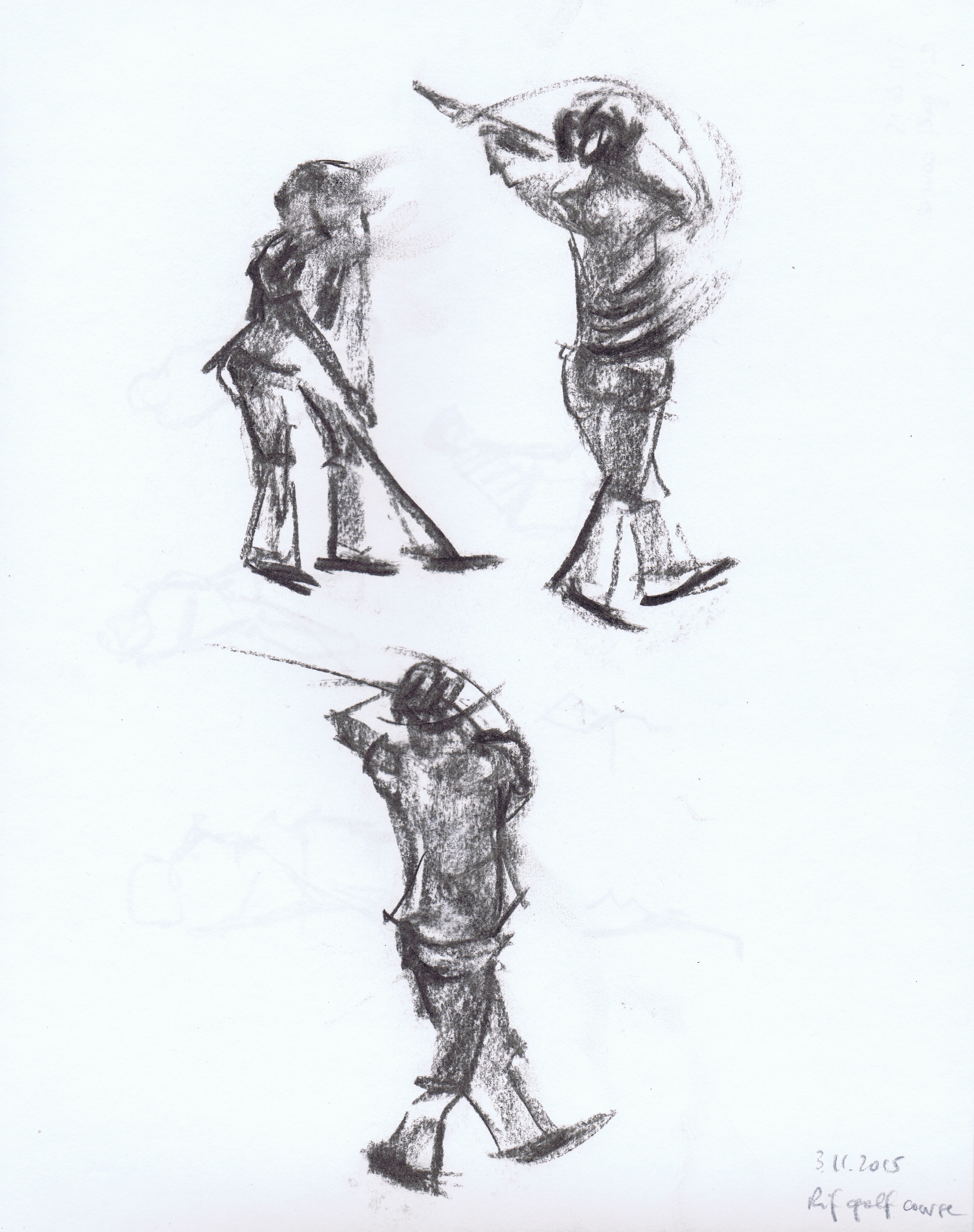
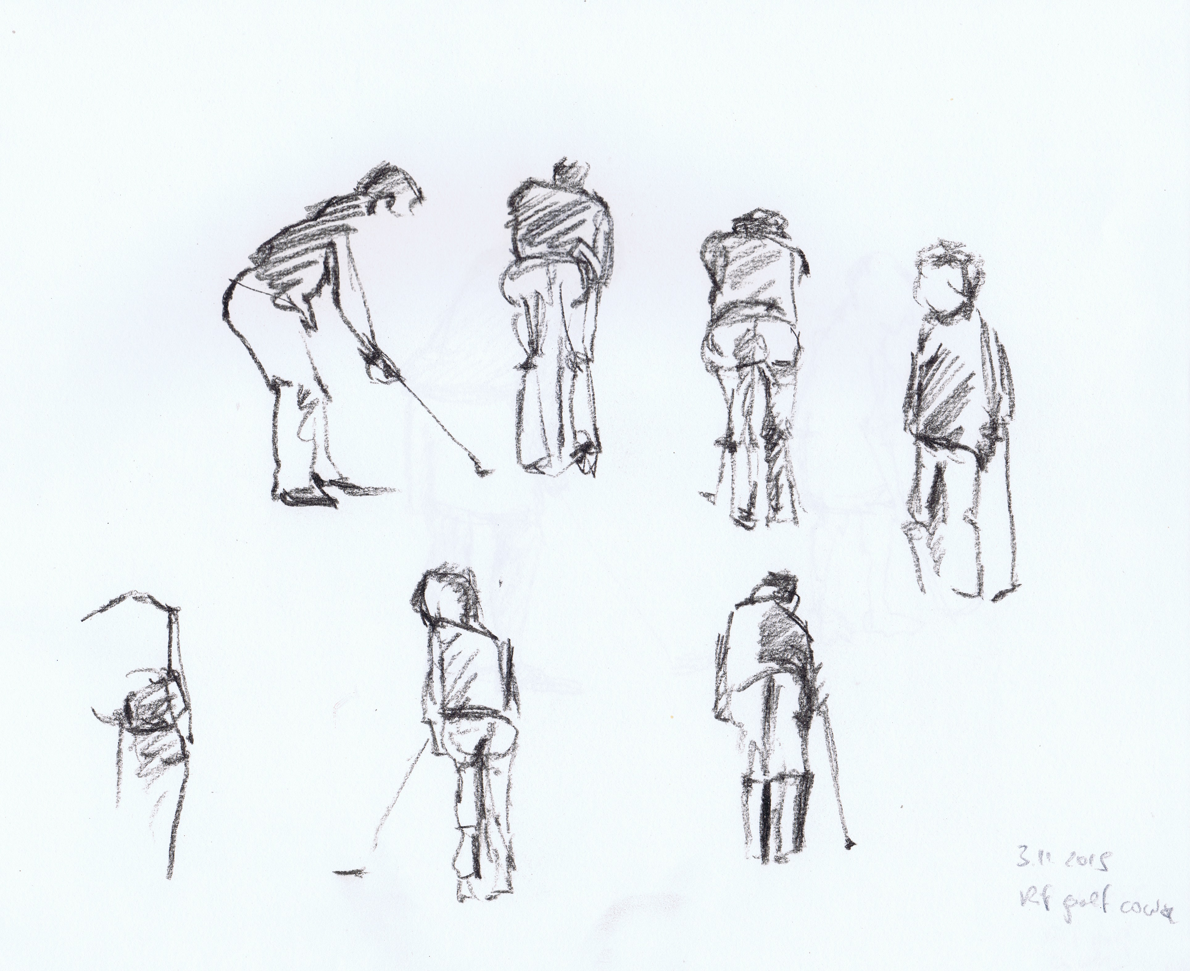
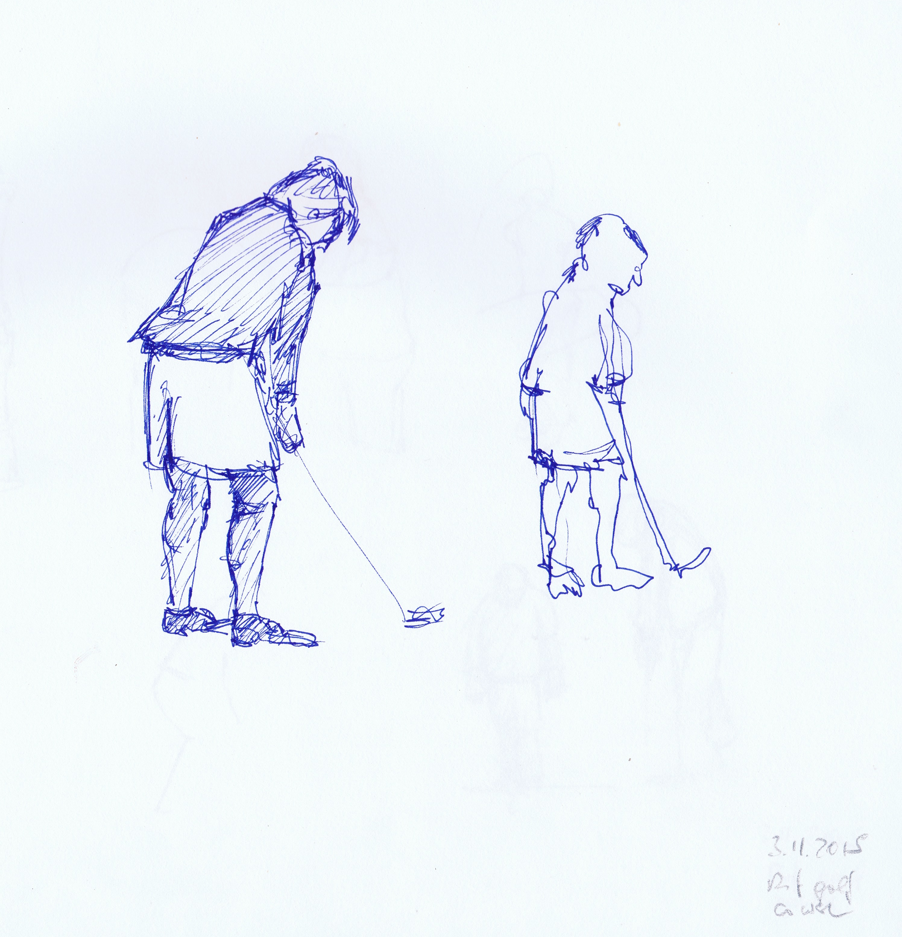
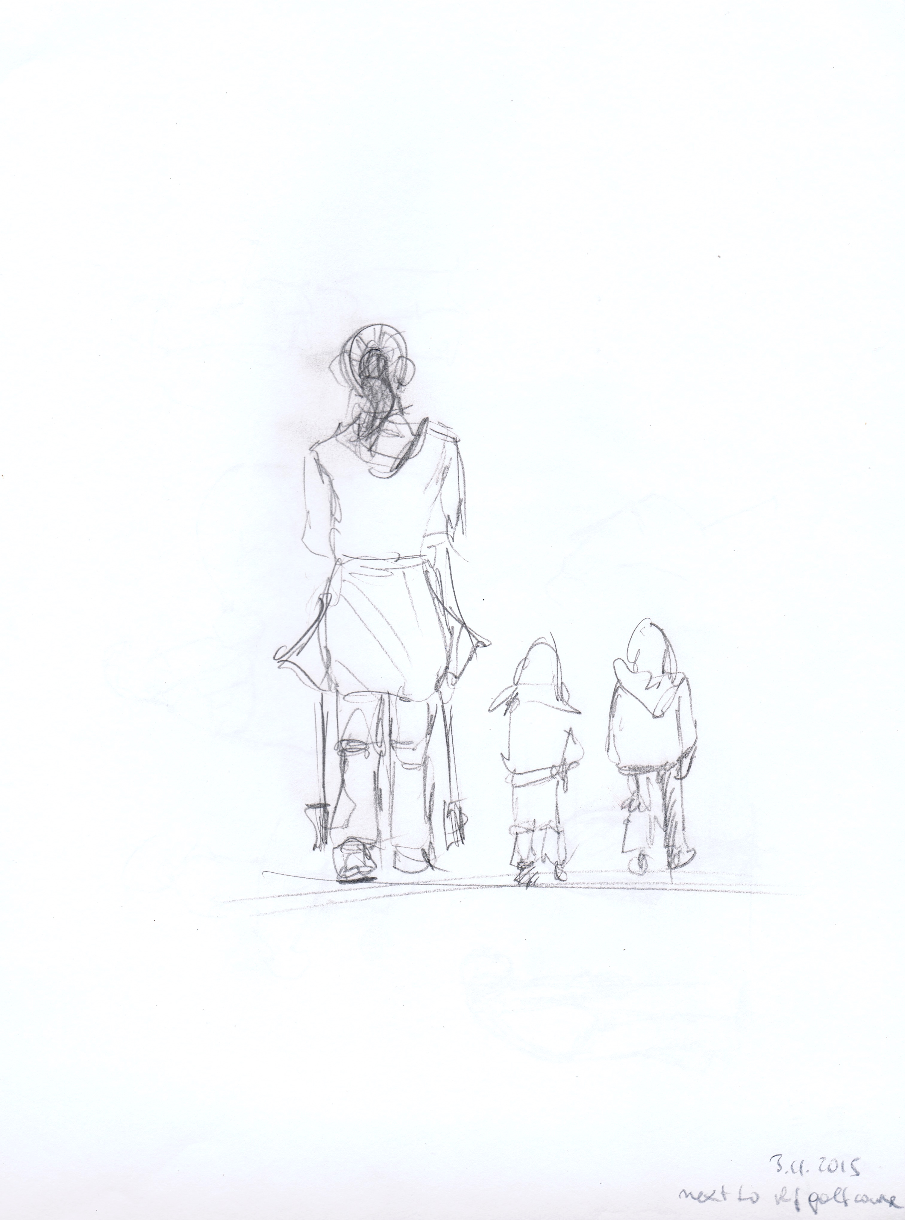
03 November, 2015. I spent a very beautiful golden autumn hour at our local golf course, drawing the aspiring golfers with a range of drawing tools (conté pencil, charcoal, blue ink pen, pencil). Instantly I noticed that, first, it takes a while to take in the typical postures assumed, second, that I will need shorthand marks to translate them into drawing language and, third, that it is immensely important to get the balance right the first time. Still, no matter how hard I looked, I had to make some highly uninformed guesses to complete my figures and I can see how it is necessary to get thoroughly acquainted with any type of movement in order to build a believable, energetic figure.
02 November, 2015. Since again I had no chance to get out, I chose two models from 360° sessions presented in the croquis cafe and chose several views each. Two or three of these I made anatomical sketches of in my sketchbook (taking a bit longer than 2 minutes), then chose a favourite for each the “standing”, “seated” and “lounging” sections. I chose different drawing materials for each, taking care to increase the difficulty in each section. For the lounging model I used chalk and pastels (A1), for the seated one neocolor watercolour crayons on an A2 background prepared with white acrylic and for the standing figure a bamboo stick and permanent drawing ink (A1). I can see how doing the anatomical studies first gave me some freedom to explore the properties of the drawing materials, although I will need lots and lots of practice to be able to use each tool to its advantage. The stick and ink were especially tricky by alternating between far too much and next to no ink. Since the latter technique required me to draw with my A1 sketchbook on the floor I unfortunately managed to place a large splash of ink next to the model’s forehead. This is the first time I decided I needed to edit a photo prepared for the blog :o).
The surroundings provided by the croquis cafe studio are deliberately bland, so there were next to no surroundings to consider apart from the shadows produced by the model and seat where present. I took a long time to decide for the most interesting viewpoints and noticed how important the negative spaces “inside” the figures are in creating interesting forms. Although of course I had no tool allowing me to change the height of my viewpoint, there were lots of opportunities to practice foreshortening. Imagining skeletal properties and muscles helped me immensely in producing increasingly credible forms, although I needed to keep going back to my Bammes anatomy book to make sure that I remembered the underlying structures correctly. Non-forgiving drawing tools requiring fast decisions and skillful mark-making like the bamboo stick I found to be very reliable indicators of problematic areas. Nevertheless, I can definitely see development going on when comparing my drawings from before starting Project 4. Yippee!
24 August, 2015. Just came home from 3 days in Innsbruck, not exactly a holiday, but a hospital stay for tests with our son. Since the tests had to be done during the nights and since hospital routine in Austria is such that you never find enough time to leave the place except for short walks, we spent ages waiting. I had my sketchbook with me and sitting hidden behind a glass door I did a few blind sketches of a Turkish lady, one of my husband (including a good laugh) and one continuous line study. The latter was great fun to do. I was sitting at a large window looking down on the street and a ceaseless trickle of patients and hospital staff. I tried to produce a kind of “walking map”, placing each person where they were walking in the street. So, in the end, I could see which side of the street was more heavily used. I think that in this case ten minutes were not enough. I would like to repeat the exercise, but would continue for half an hour or so and thus create an abstract image of densities.
Left and right: the Turkish lady and my son on a hospital-owned children’s tractor, which he kept going round on in circles for hours, driving the staff mad
Left: blind sketch of my husband ;o) Right: ten minute continuous line study of walking traffic on the hospital street
15 August, 2015. Today I finished the official drawing for Assignment 3. The places where I had ripped off the tissue I used to place the ghosts of the two old owners and their cat. I hope that this creates the impression of them always being there, but below the surface. In some places I increased the contrast and added rising dust, although I found that the latter interfered with the sketch of the demolished part of the house and so I had to be very selective here. Overall I think that I managed to stick to my plan and be inventive, using techniques new to me (e.g. charcoal on acrylic, black oil pastel and rubber etc.).
Assignment 3: finished piece Mixed media: watercolour and conté pencils, acrylic colours, acrylic modelling paste, crushed willow charcoal and charcoal pencils, various tissues and papers Assignment 3, detail: reflectionAssignment 3, detail: persons and cat “below the surface”
Self-assessment (p. 7 of the study guide):
1. Demonstration of technical and visual skills: I take care to make good use of the skills acquired so far in the course. Composition still isn’t a particular strength of mine, but with careful planning and experimentation I think that I can arrive at something interesting.
2. Quality of outcome: I try to be coherent in developing my stories from scratch. In Assignment 3 this included photographic observation, visiting the site, talking to the new owners, sketches and experimentation with different media. By including a fourth dimension (time) into an otherwise 3D view I hope to have created and communicated an emotionally interesting story. I will have to experiment a lot more with different backgrounds, in particular when using various papers to draw on. In Assignment 3, in some places the folds and creases produced were too prominent and had to be taken off, which on the other hand allowed me to make use of the unintentional new structure.
3. Demonstration of creativity: I think that by experimenting on a large scale I am starting to develop a personal voice, although there is so much to discover that at this stage I want to embrace every possible chance for development, even if it means abandoning a budding personal voice.
4. Context reflection: I have made a habit of researching artists, techniques and art history before embarking on a new project and in order to be able to make more informed decisions during projects. I also put down my own thoughts in my learning log in a consistent way.
When putting on the final layers of my assignment piece I knew that there was something else I wanted to do, using my new-found wild style of drawing and ideas from the set books. So I took some smooth white paper (the one coming with the frames for my exhibition, with green print on one side) and produced the following with lots of water and a bit of colour, ink and several drawing tools (sticks, pens). I did not look at my sketches or photos at all, but tried to draw what I felt at the moment of drawing without lifting the pen. I think that this exploratory type of mark-making is a bit like sculpting and this is why I want to try and enforce in Part 4.
Exploratory drawing of assignment subject Watercolour, inkExploratory drawing, detail
10 August, 2015. In preparation for this exercise I tried to fully remember the atmosphere while making the sketches. It was mostly the heat and wasps, which blurred my vision somewhat and this is what I will attempt to show in my drawing. To this end I wanted to try and use marks reminding of the seemingly erratic and highly energized flight track of a wasp to distort the outline marks of the buildings. First I tested the intended mark-making in my sketchbook (please ignore the dark grey blotches, ink from overleaf bled through, unfortunately):
Flight path of a wasp Ink pen
I then made the required two-page preliminary sketch with a permanent ink pen as well as a well pen with water-soluble ink and water. The main subject, the incredibly versatile brick wall from my first sketch I put at the centre of interest, while the remaining buildings I wanted to be “drawn” by the wasp’s flight path. In order to do this I let the wasp enter and leave (just as they would do in reality) and then started jumping from position to position to complete the drawing here and here, but not everywhere, standing still for a while in one position and flying rapidly from one place to another. It was great fun to do and I hope that this will become visible in the finished drawing (where I would like the wasp to do all the drawing, not just on top of the sketch, which means that not all the lines from the sketch will be there). I also want to keep the layout as in the sketchbook, because I think that having the actual drawing slightly to one side and thus giving the wasp a space to move onto and off the stage looks quite dynamic.
A wasp’s flight path drawing of a building site in Hallein, permanent and water-soluble ink
For the finished drawing I used grey A2 sketch paper, because I hoped to convey the oppressing heat, and drew on it first with an F size ink pen to make the wasp tracks:
Hallein building site 1st stage: wasp track ink pen size F
To focus on my main interest, i.e. the facing brick wall, I went over the drawing again with an SC (soft brush) type ink pen, then swapped pens until I was sure I should add no more information. To be honest I like the first stage better, because at least to me the dark vertical lines to the left and right of the brick corner became too dominant, which in turn forced me to include brush strokes all over the drawing. Although the outcome was not completely satisfactory, I liked this way of drawing very much and I will come back to it.
Hallein building site 2nd stage: F and SC size ink pens
22 July, 2015. There is a nice and shady place in the city of Salzburg, which is a favourite with everybody, in particular when the weather is as hot as it has been during the last week: the Bräustübl. Apart from making a much loved brand of beer the monks serve nice food. And it is a beautiful opportunity to study people. Most of them will not move around a lot, except to get another beer, and since they always come with their family and friends they talk and will not take notice of me making sketches from ambush. Still I did not want to take risks and finished this sketch after five minutes.
20 July, 2015. After a very, very long day making a trellis for our house, followed by cooling off swimming in our river, I set off in the car (no cycling, because a thunderstorm was about to break loose) to a place near our zoo, where there is an open view in all directions. I sat down on a very old wooden bench and started drawing. Two minutes later the thundercloud had reached me and forced me to continue drawing sitting behind the steering wheel. Towards the end of the exercise the sun came out again and I was able to complete the last drawing sitting on my bench. I find that I have to draw very quickly to complete satisfactory landscape sketches within 15 minutes and I can see why there should be such a strict time limit. It allows intuition and conscious planning to work together selectively.
360° study: east, towards the village of Anif, ink pen360° study: north, zoo entrance, ink pen360° study: south, Watzmann, ink pen360° study: west, road towards Salzburg, ink pen
17 July, 2015. Another very hot day. I had my viewfinder on me while cycling along one of our favourite walks in the area. It did not take me long to find four spots and the heat sped up my drawing.
First view: Footbridge over small forest stream, ink pen
In the first drawing, foreground, middle ground and background zigzag across the view (stream, bridge, wooden fence, houses). I can see that in this drawing I had to loosen up first, but I think that the composition is not too bad. It is important for the footbridge to end inside the frame of view, so that the spectator is guided into the picture. There appears to be, however, a break between the left-hand end of the bridge and the fence, which looks odd. Maybe the structure of the fence should be less detailed in order to support the spectator’s walk from front to back.
Second view: View over field with farm, Barmsteine and Göll mountains, bicycle in the foreground
The second sketch has a more classical structure of foreground (bicycle), farm building with trees (middle ground) and two sets of mountain ranges at the back. I like how only part of the bicycle forms the foreground. Being so close to the spectator it helps to fathom the expanse of the field between my seat and the farm building in the middle ground. Again, the drawing would probably have been easier to understand, if I had reduced the detail in the building. I think that the easy flow of ink and equal line width in my ink pen makes it necessary to think more clearly about where to put the emphasis in a drawing as compared to a soft pencil.
Third view: Building site, ink pen
I quite liked this building site. Apart from being able to draw from a shady position behind the hedge on the left, it had a set of very attractive components, which made it easy for me to decide what to include. The old piece of fence allows the view of the spectator to move from the gravel path round the fence post (foreground) into the jumble of the building materials, which is at contrast to the sober style of the modern flat-roofed building (both middle ground). The background is formed by a shaded older building, which in my feeling connects somehow to the old fencepost and emphasises the sunlit corner of the new house and part of the gravel path.
Fourth view: Entrance to overgrown path between fence and spruce forest, ink pen
Originally, the fourth view had been my favourite, but a minute after I had started my sketch a car would pull up and park only millimetres from the gate on the left so as to block my complete view. Two elderly gentlemen stepped out and took aeons to walk round the house to the right of my view in order to see whether the lady was in. Not having found her at home, they sat in the car for what felt like another eternity. When they finally set off again, I noticed that in the meantime the left side of my sketch had become less loose than intended. I still hope that I have been able to suggest a route into the drawing between the different poles and posts.
Having thoroughly enjoyed this exercise I can see how – with practice – everything in the visible world can be the basis of a work of art. There are no limits.
11 July, 2015. From the preliminary sketches I had made on site I chose a sandy dell, around which trees grow in a scattered manner, because I liked the way the shadows fell across the dell and the weird solitary tree with a reddish trunk appearing to grow straight out of the sand. The shadows helped to structure beautifully an otherwise bare stretch of ground between the trees and bushes growing along the river and a cluster of smaller trees under the canopy. I chose the view so as to place the horizon very high up on the paper.
Here is the on site thumbnail sketch again:
thumbnail sketch, ink pen
In order to support my intentions of including a suggestion of a past flood I chose a torchon watercolour paper, water soluble and waterproof markers, ink pen as well as oil pastels. Also, following the suggestion made by my tutor to build on successful outcomes from previous exercises I pushed myself to draw in a very loose manner and included a technique I had first tried out when drawing my piece of driftwood in Part 2 (project 3, exercise 1) of the course. Here is the sequence:
first sketch, waterproof markerssecond stage – colour added with water-soluble markersfinished drawing with foliage of trees growing along the river added with oil pastelsdetail of finished drawing, ink pen and oil pastels added
I am very happy with the outcome. I think that my composition is interesting due to the chosen view (high horizon, sandy dell leading into and out of the picture diagonally, this diagonal structure broken and balanced by the two groups of trees connected both by the leaning trunks and shadows on the ground and colours). Also, I am happy with the way I captured the light falling on the dell through the foliage at the back of the composition – although I became aware of the intensity of that only after having finished the drawing, so not all of that intentional or due to skill ;o).
Regarding the questions to answer from the instructions for this exercise I think that form and mass are shown in a believable way, making use of line, texture, colour and contrast. I did not deliberately distinguish species, although the habitus of the trees shown might provide some information on the species depicted. The mass of foliage and spaces between I drew with a bottom layer of ink pen, and on top of that, in selected places, different shades of green oil pastels. Light on the trees was suggested by deliberately leaving the sunlit areas white or using light tones only as well as by dissolving part of the marks made with the water soluble markers. I think that I managed to select and simplify by drawing in a very loose way in the beginning and by leaving parts of the drawing “unfinished”, in particular the shadows on the ground.
While drawing I discarded the original idea of a “past flood”. The changes I would have had to make to the finished drawing might have destroyed it completely. However, I have an exciting idea for a follow-up drawing and I hope I will be able to come back to this during preparations for the assessment stage.


